How do you take an existing brand and inject the spirit that truly reflects a school’s identity?
the project
Equality Charter School came to us shortly after launching a new brand identity and website. the challenge? while everything was technically “new,” it didn’t feel like them.
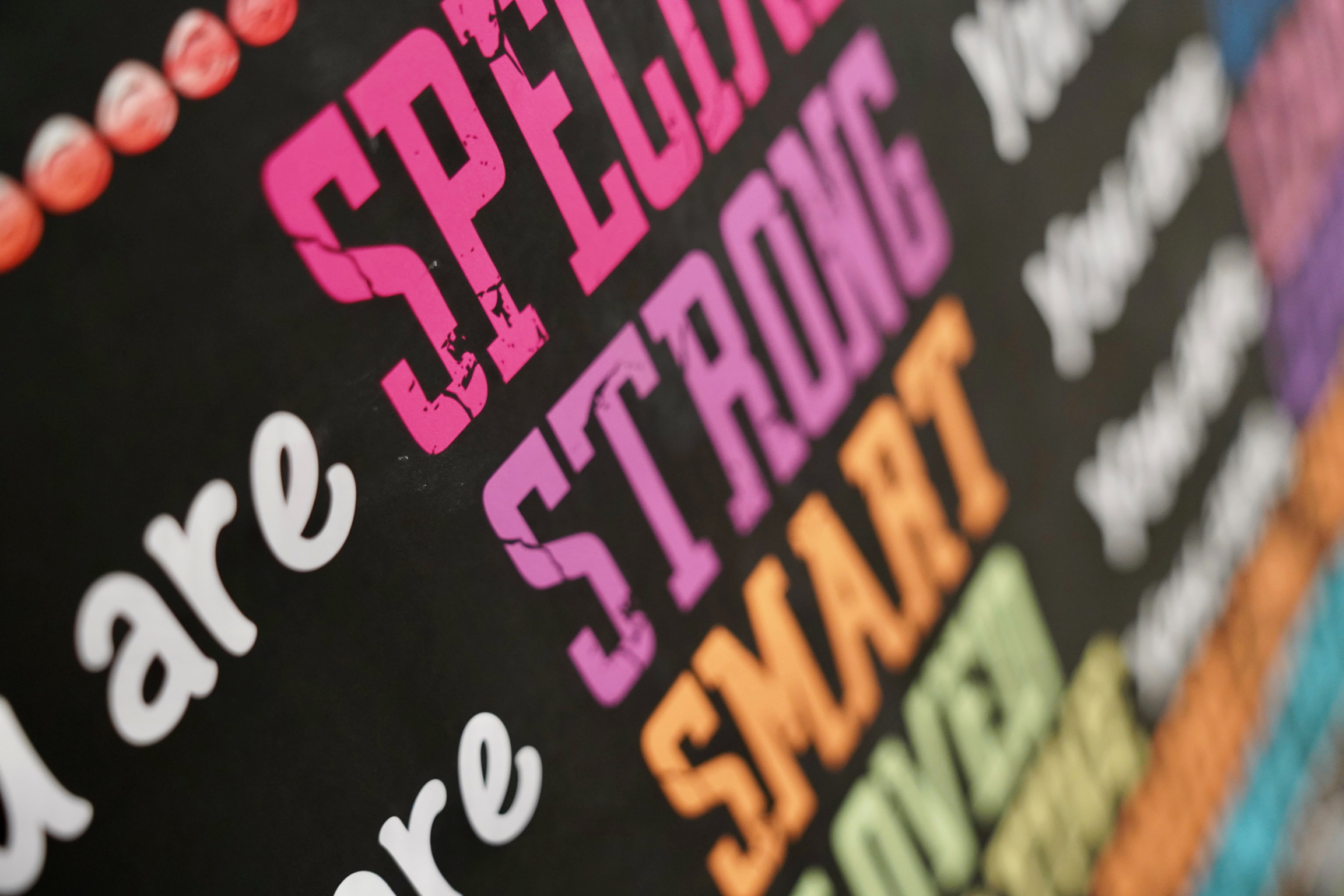
Instead of starting over, we took their existing brand and infused it with personality, warmth, and joy — staying true to who they are while making the brand feel alive. the result was a refreshed, expressive identity that finally reflected the school’s spirit — without the cost of a full rebrand.
deliverables
- Refreshed brand guide
- Updated brand color palette
- Refined brand voice and tone
- Developed a colorful, joyful illustration style
- Photography and video
- Website strategy, design, and development
- Ongoing website maintenance and analytics
- Ongoing graphic design support
The work
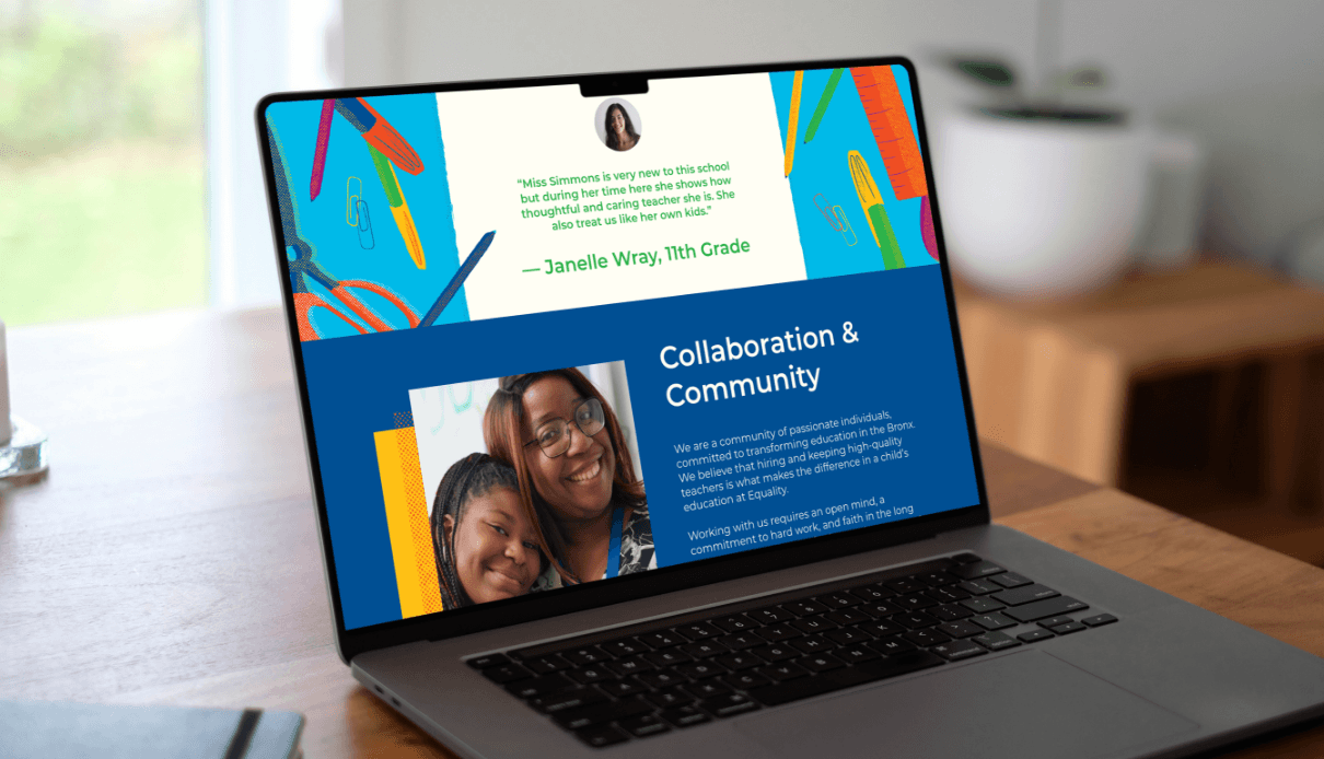
website
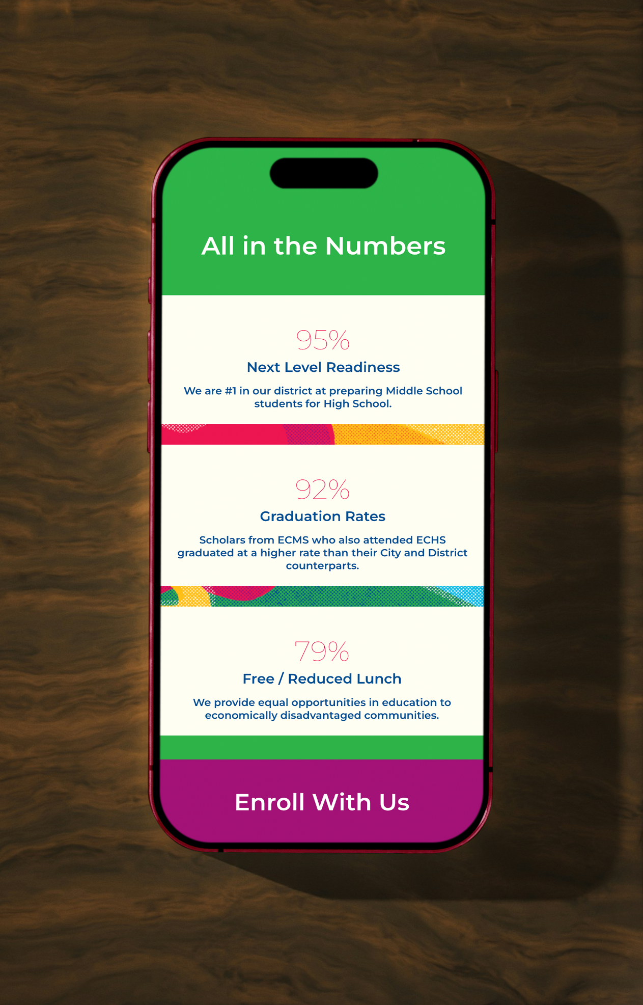
We revived the current website through two lenses: a content strategist evaluating structure, language, and audience routine, plus a design lens evaluating visual and interaction design.
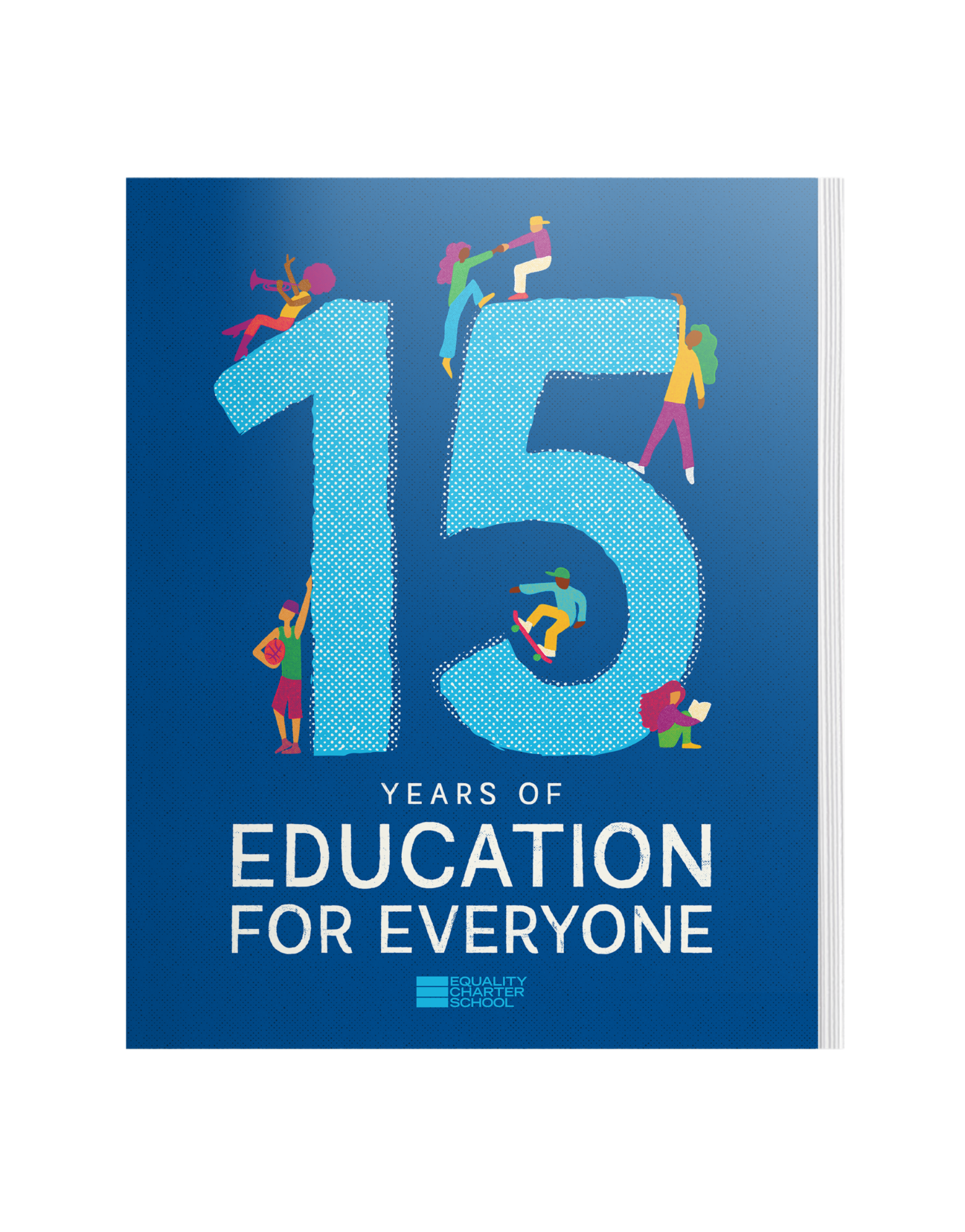
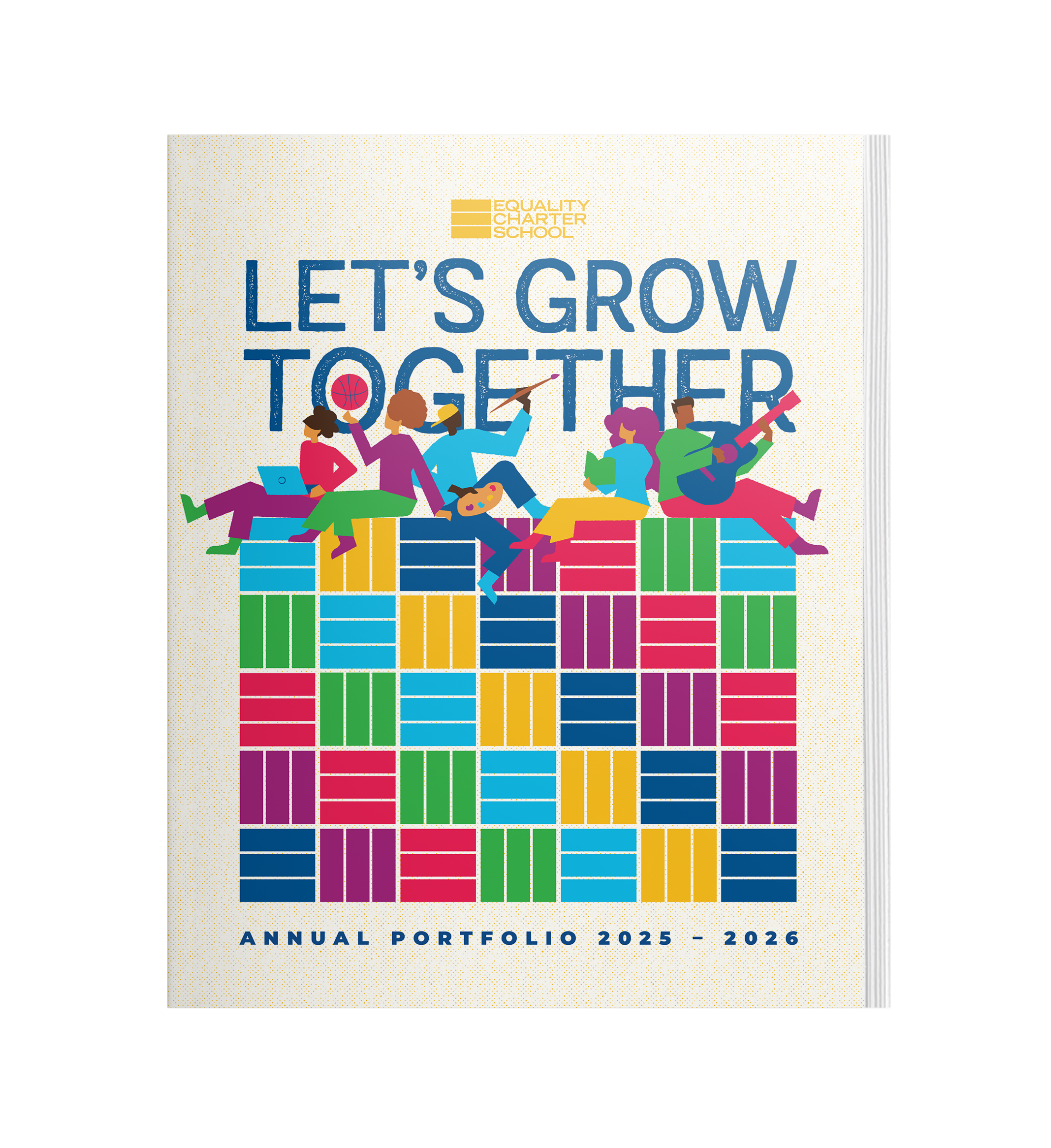
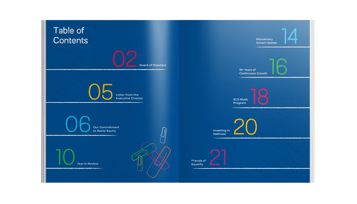
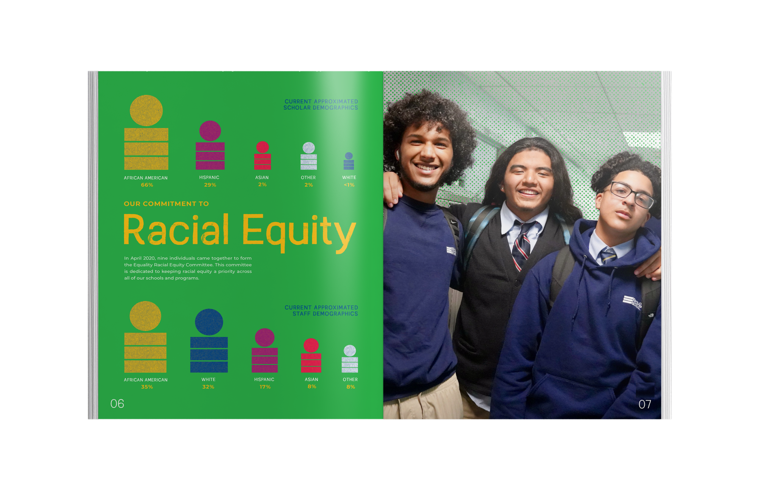
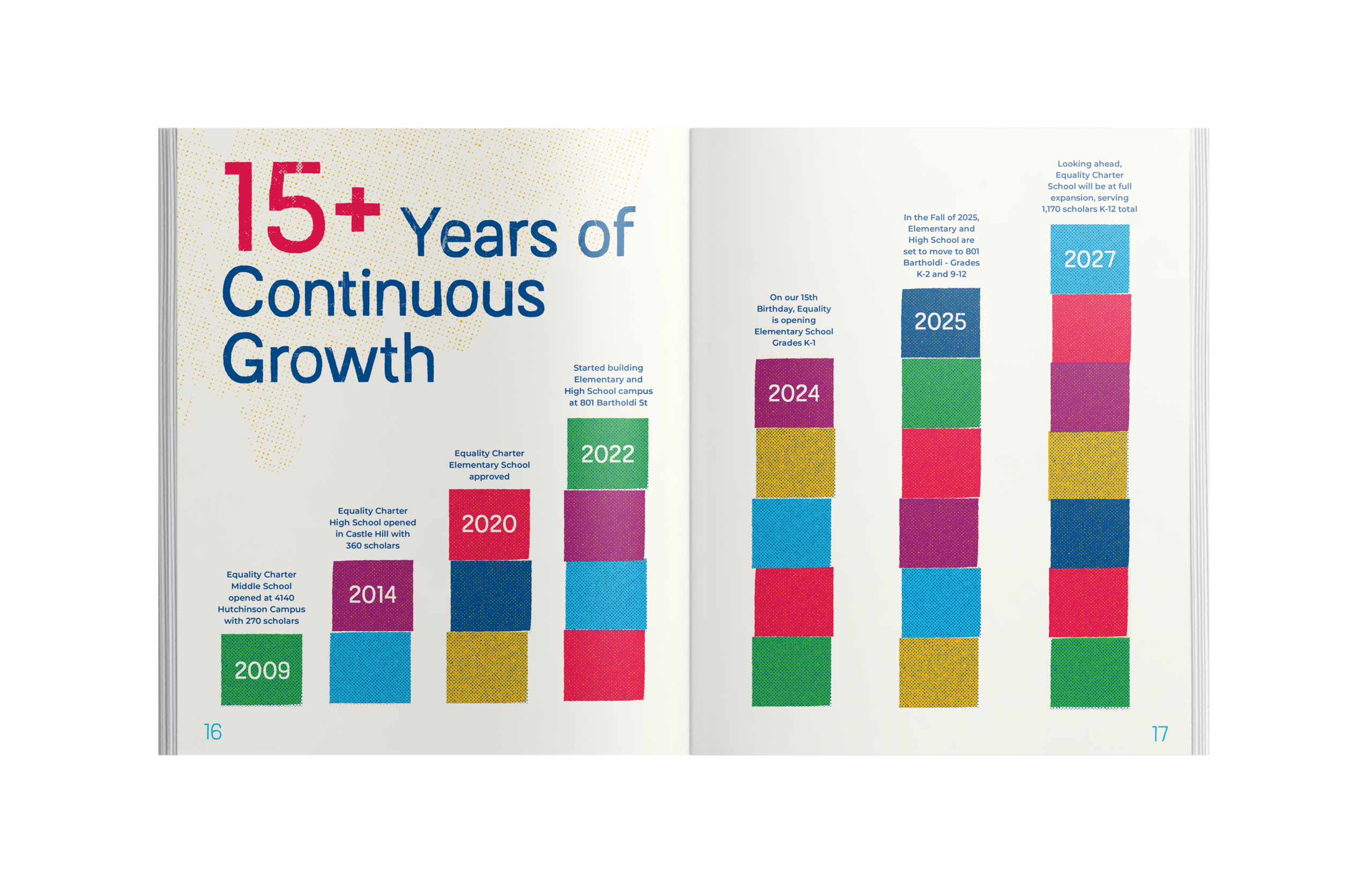
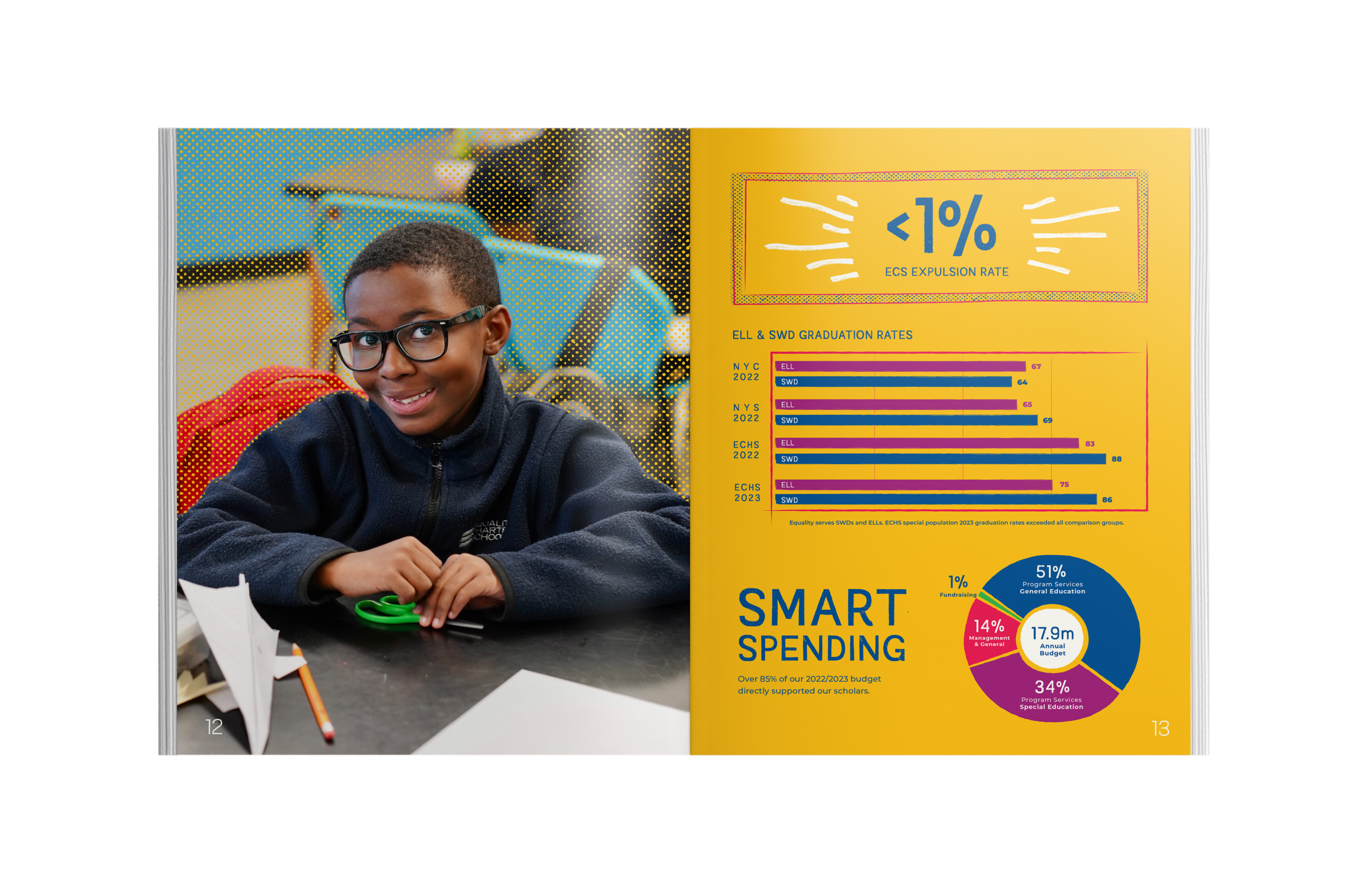
Charter schools rely on campaigns and fundraising to ensure their students can have the resources they need to thrive, and the Annual Report serves as a way for Equality to tell their story to their supporters each year.

photography
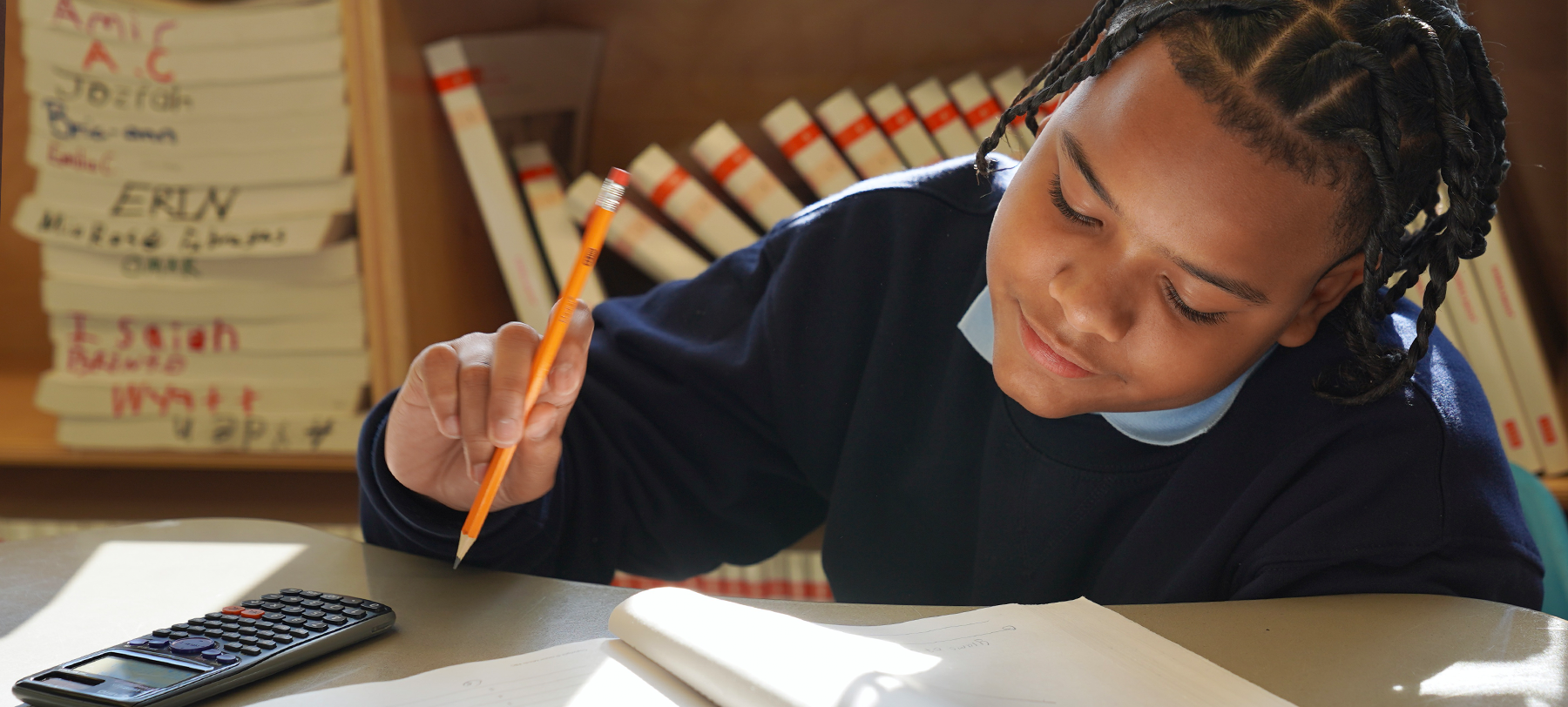
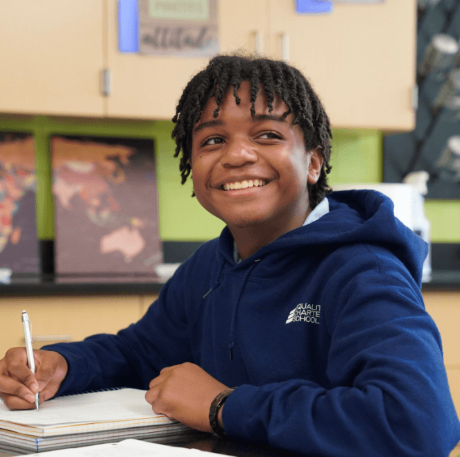
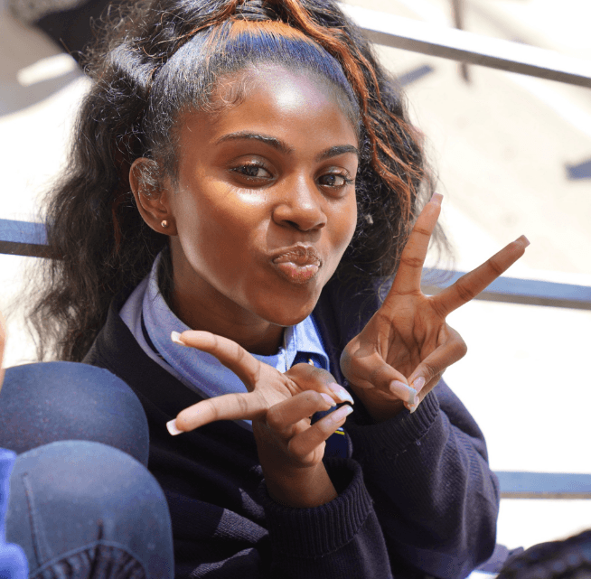
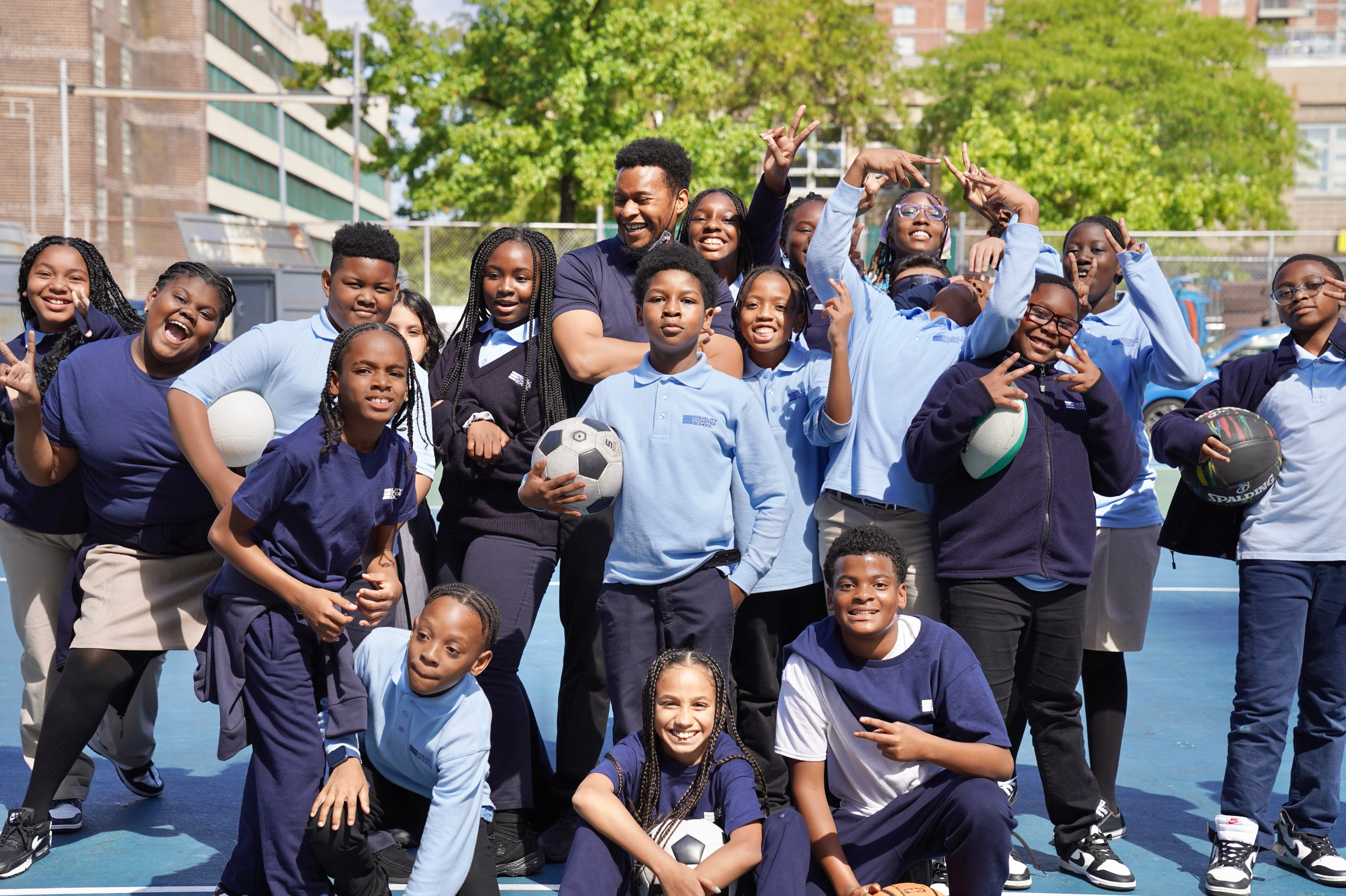
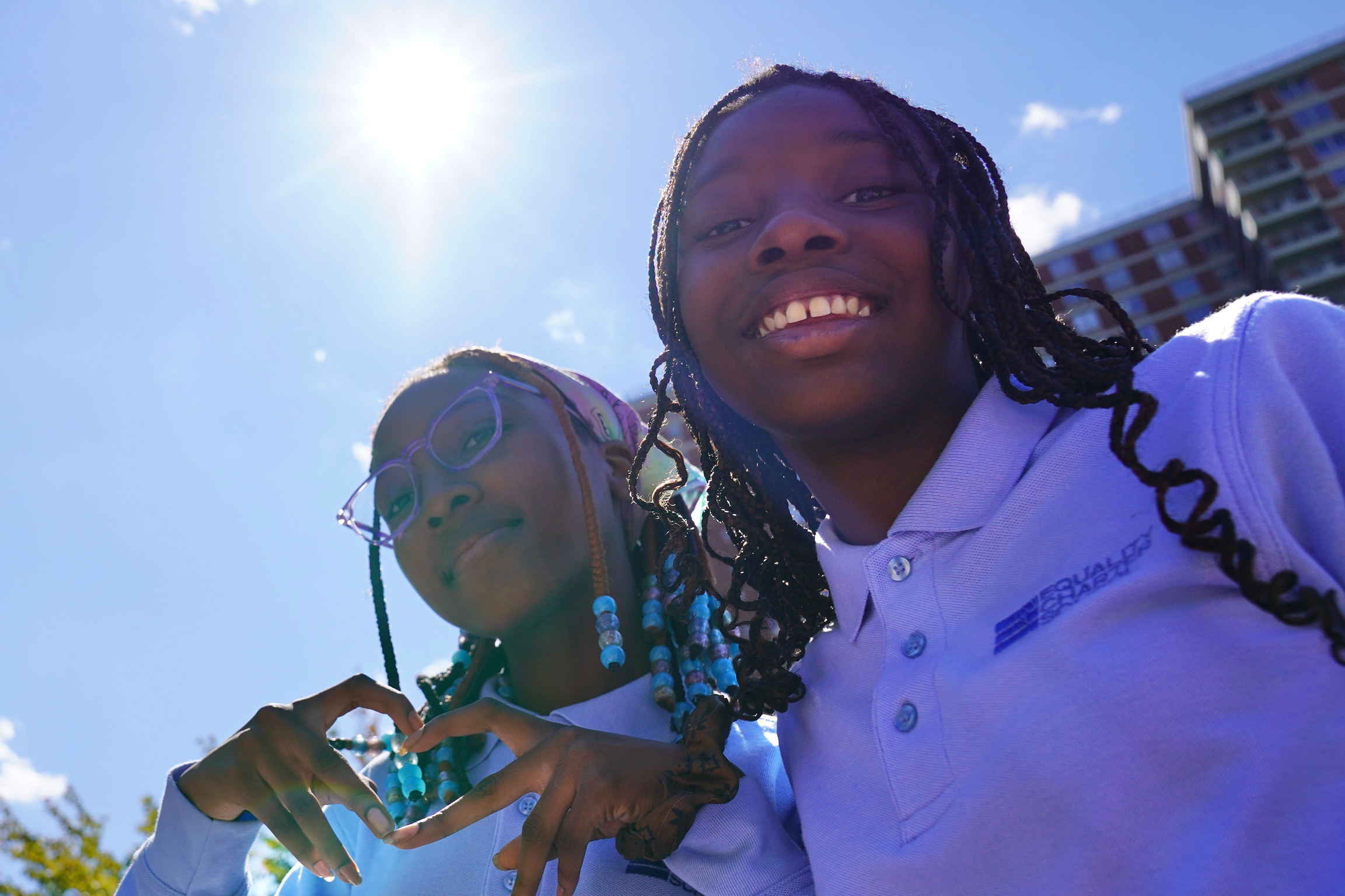
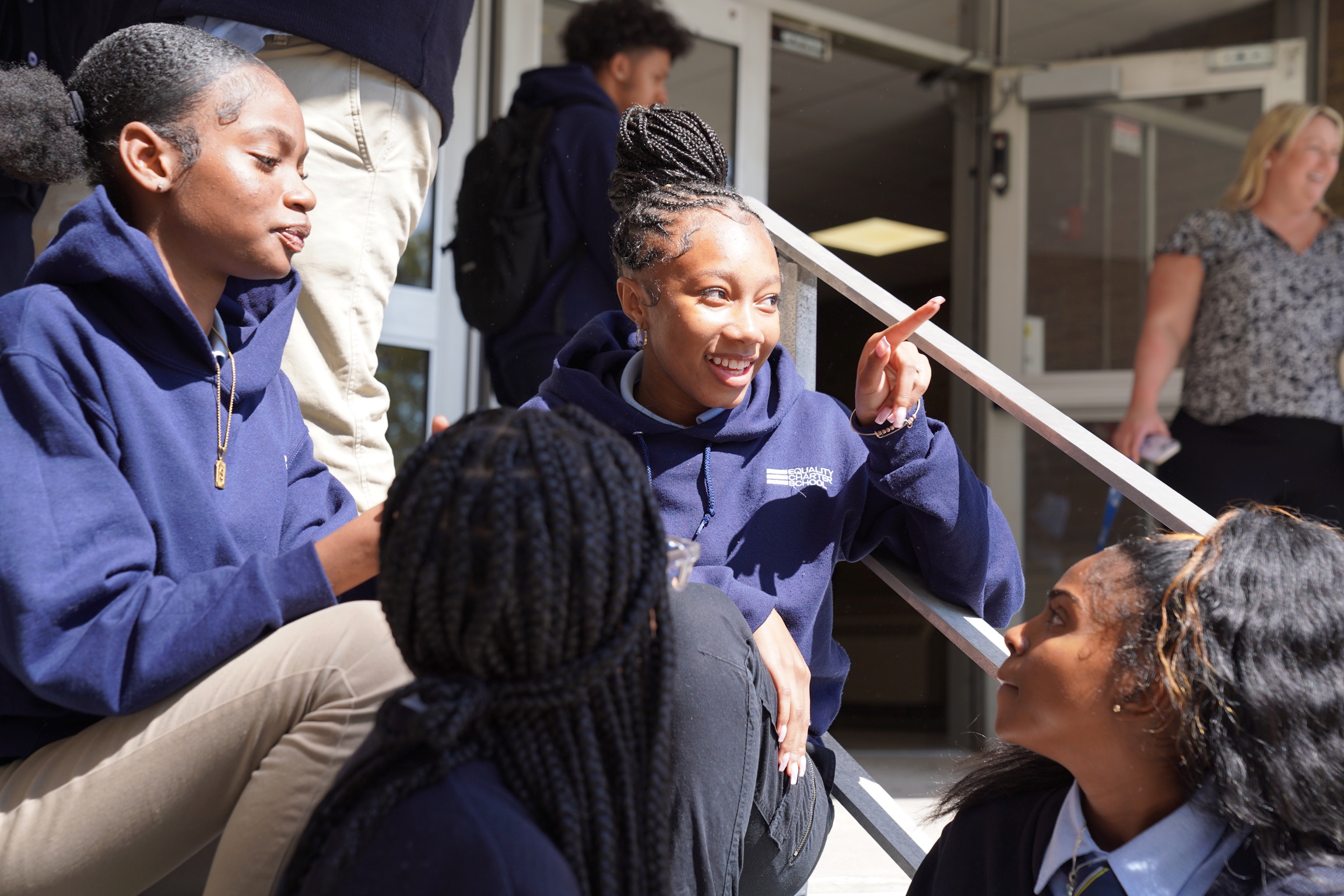
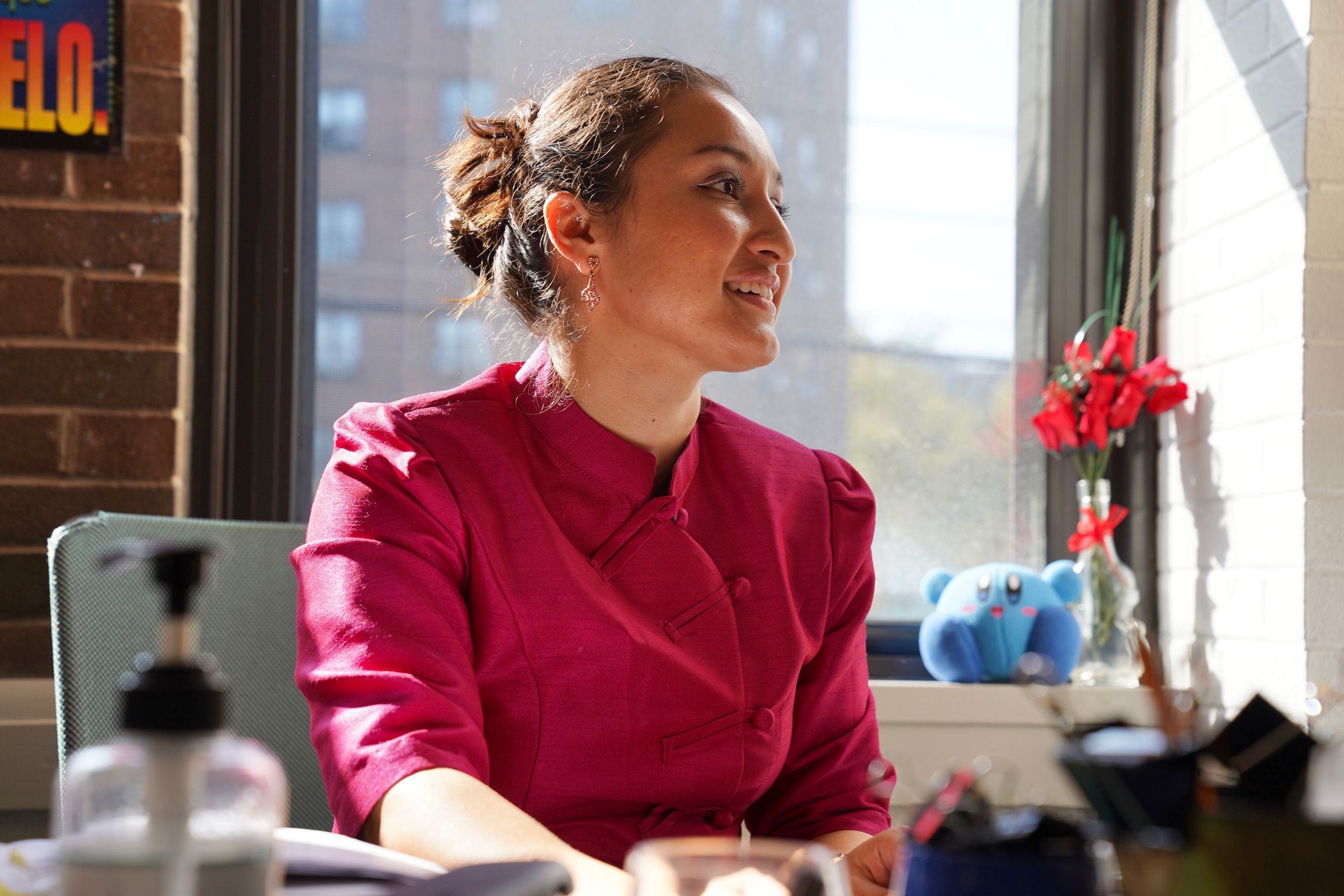
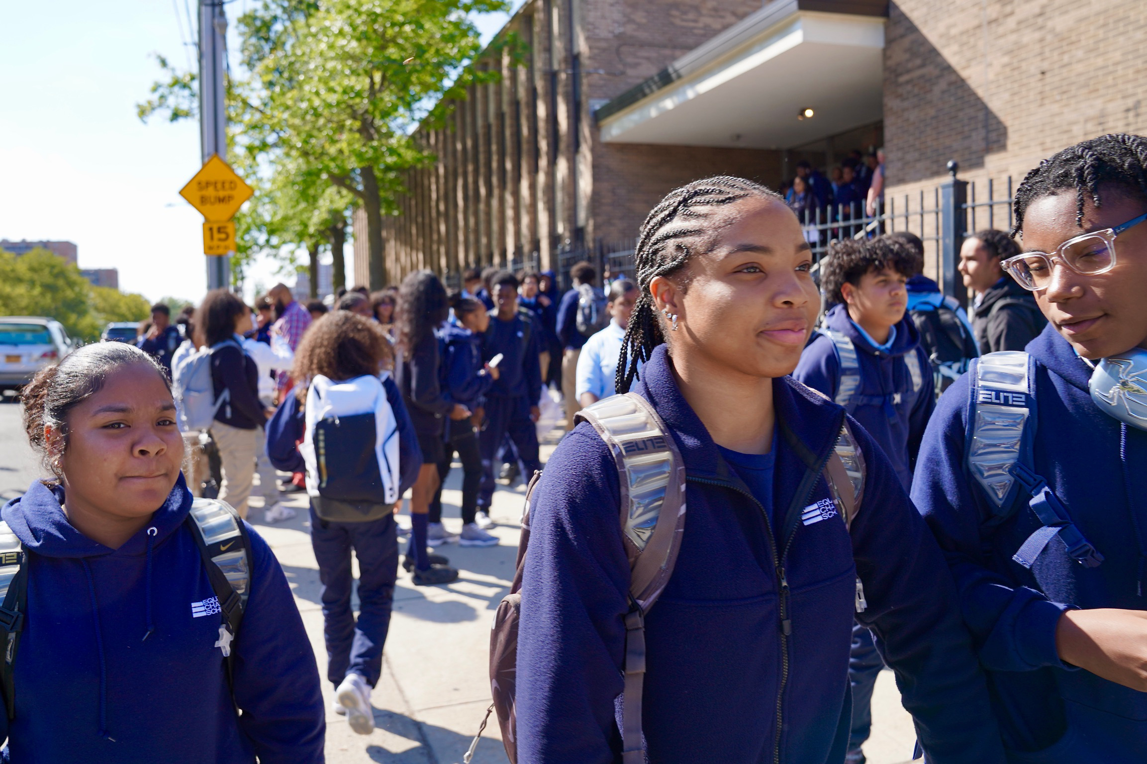
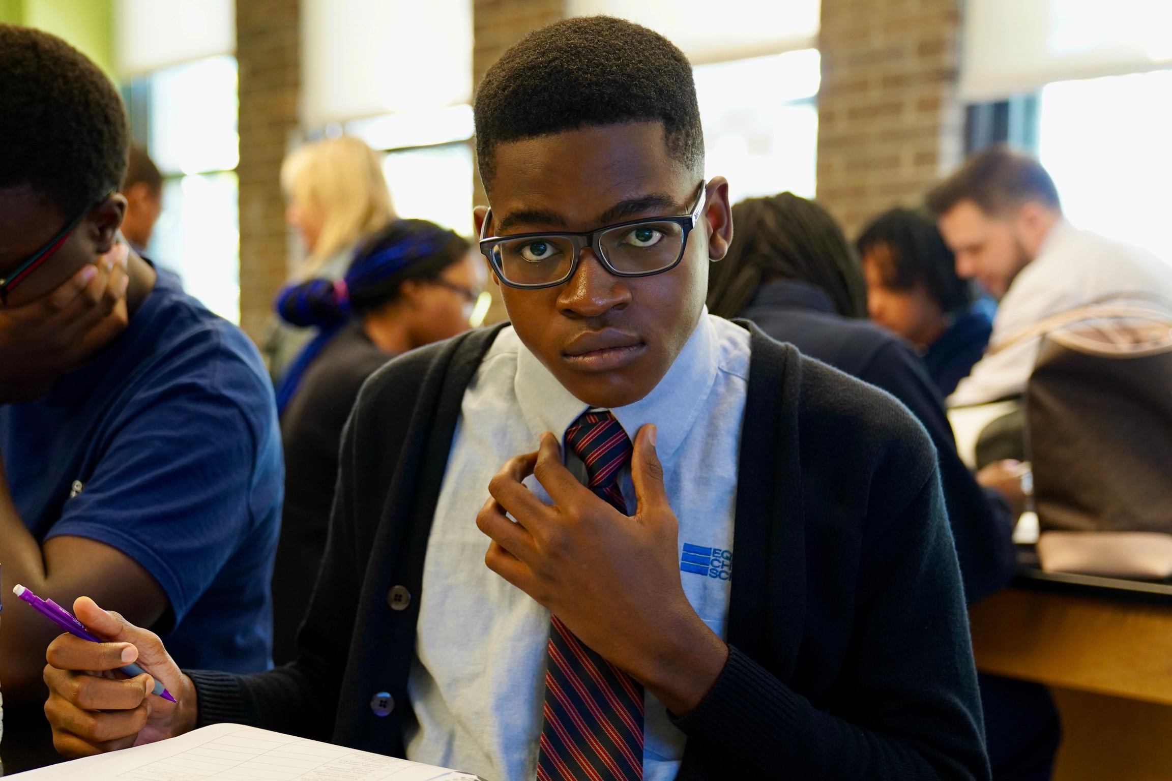
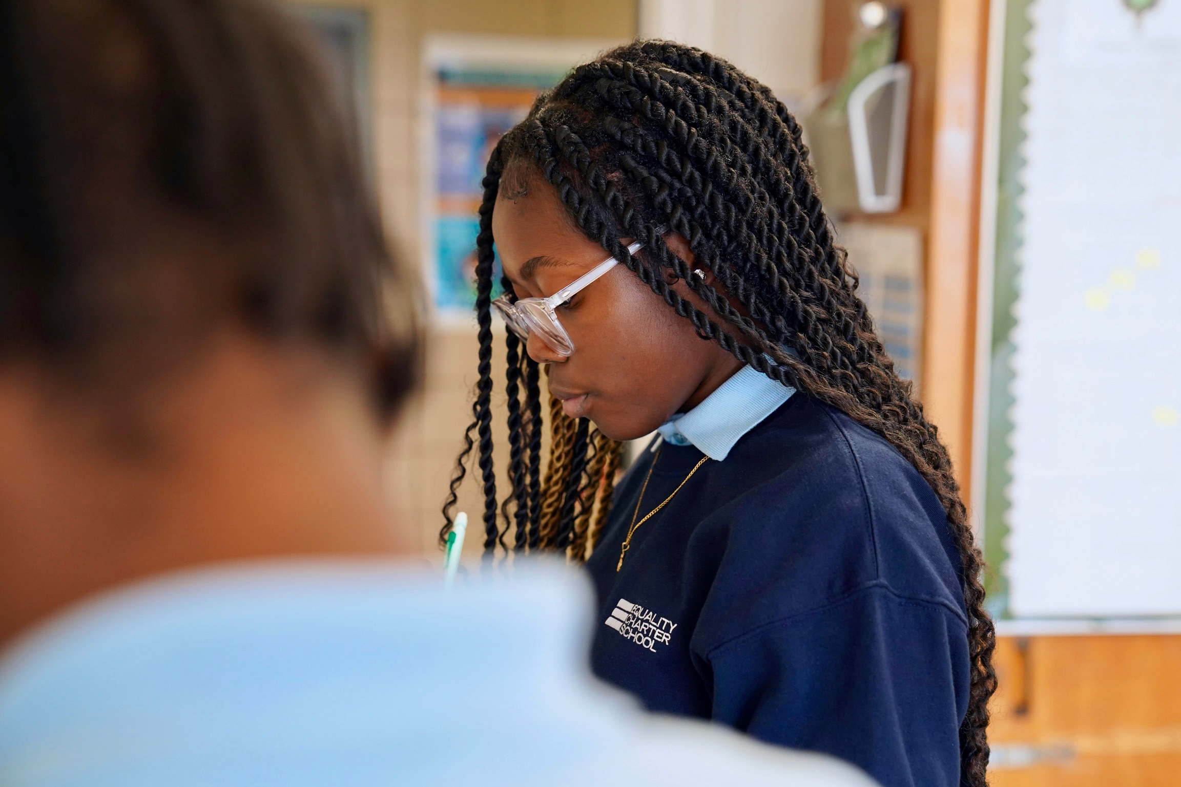
We traveled to The Bronx to capture a day in the life of Equality students and faculty.
The results
-
22%
increase in online donations
-
30%
conversion rate for enrollment form downloads
-
40%
increase in engagement rate and page views